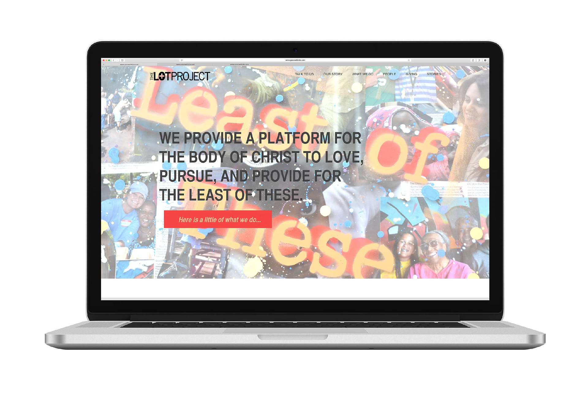
The first image below was the initial website for the LOT project.
Main issues: Lack of unified/branded imagery, vague call to action button on home page, lack of consistent information throughout the site, no clear user path
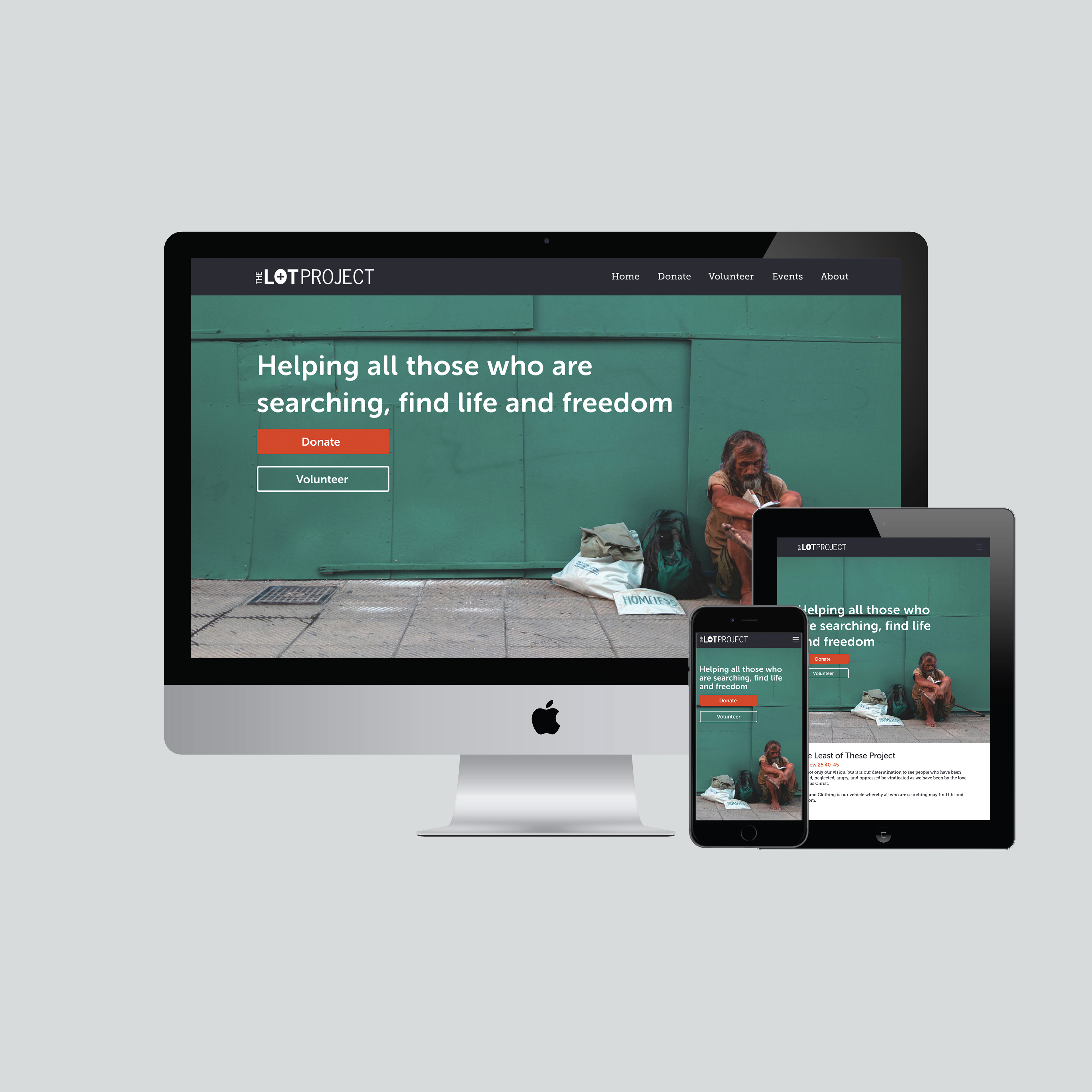
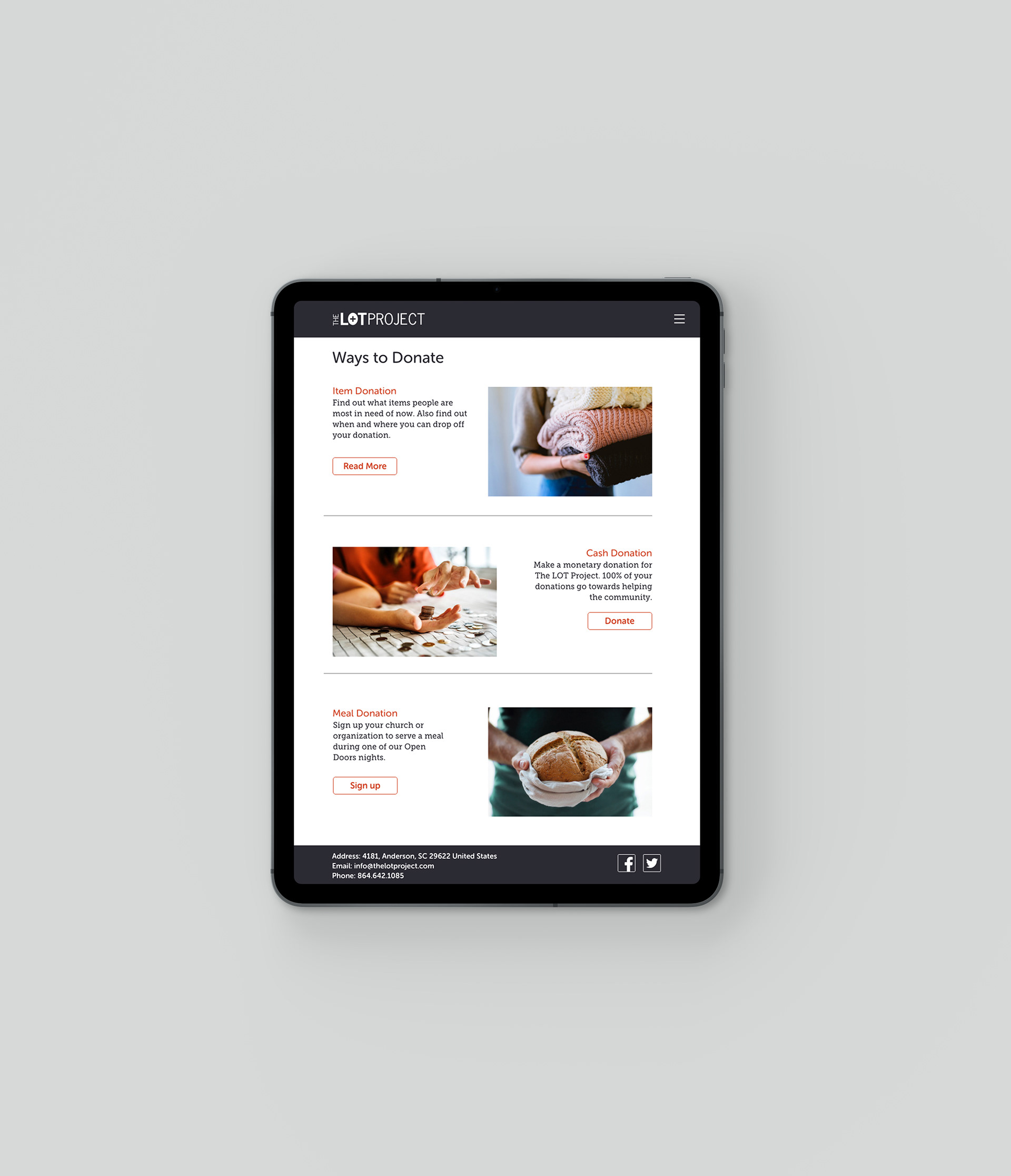
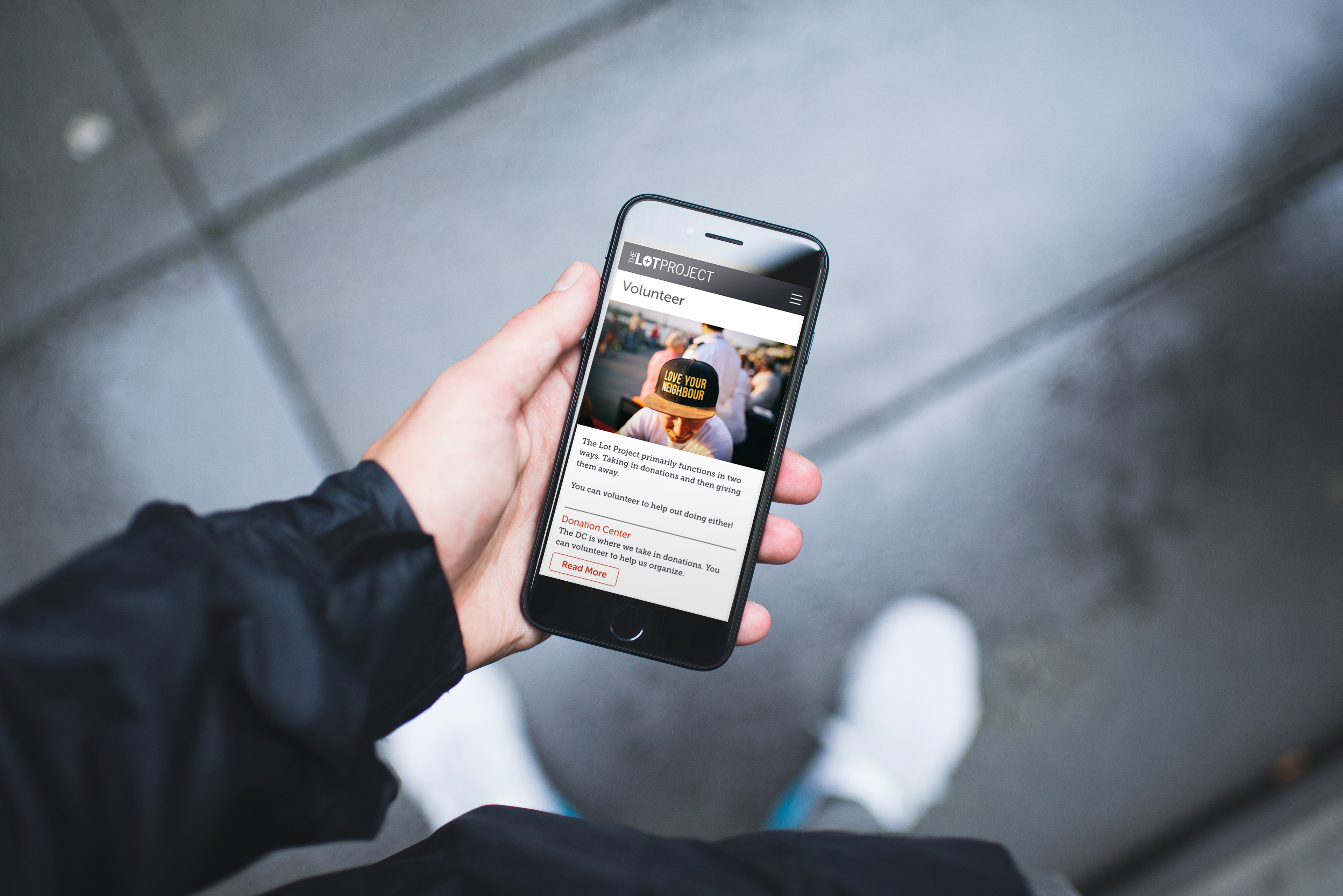
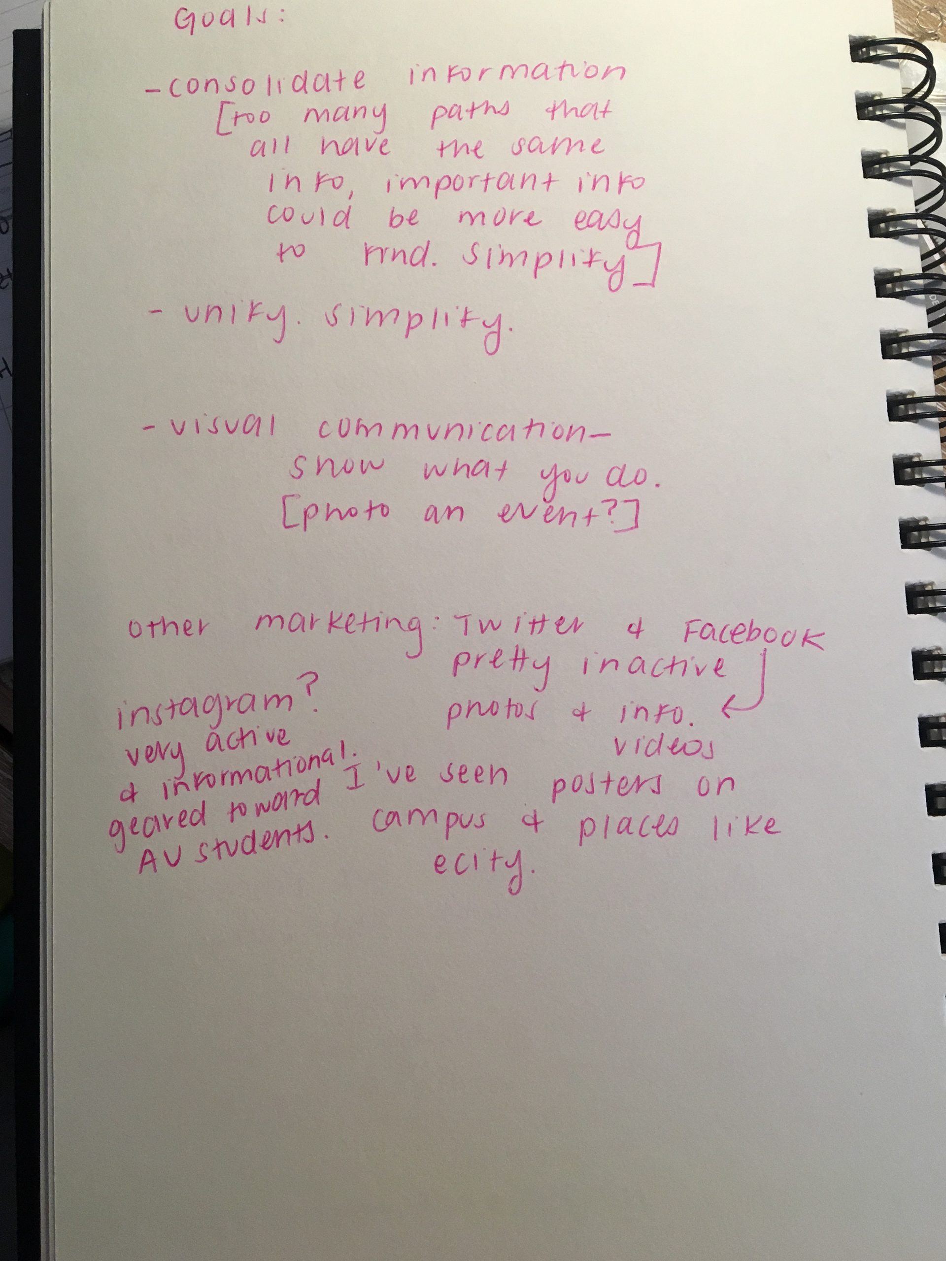
The main goals of the redesign were to simplify and unify visuals, making navigation easier and more efficient for the user, and to increase donations and volunteers.
Initial research helped in identifying primary users, discovering their main objectives and making information accurate and accessible. Interviewing and understanding the owners of the non-profit was also a crucial step in coming up with the best design for them.
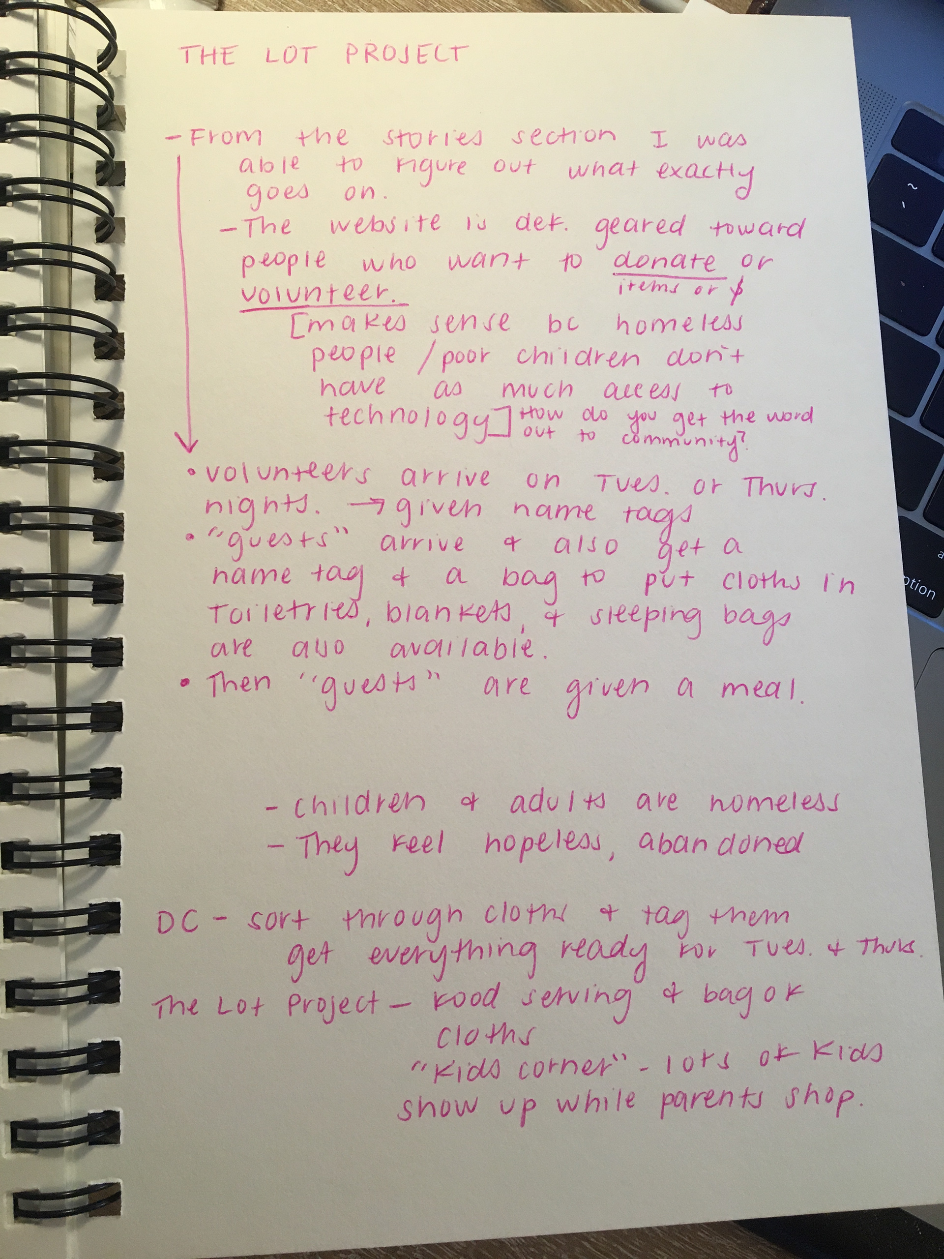
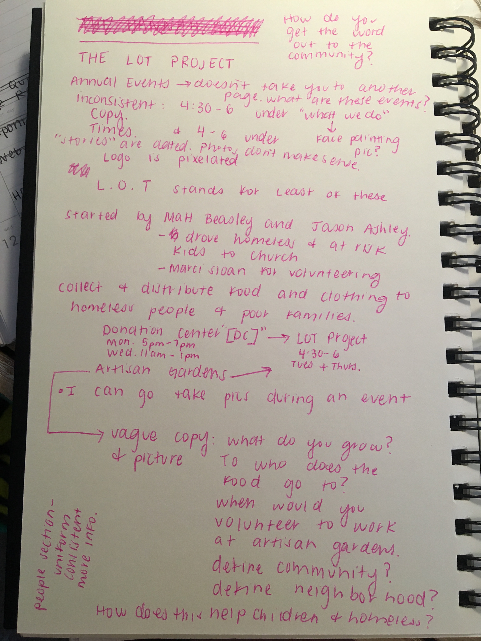
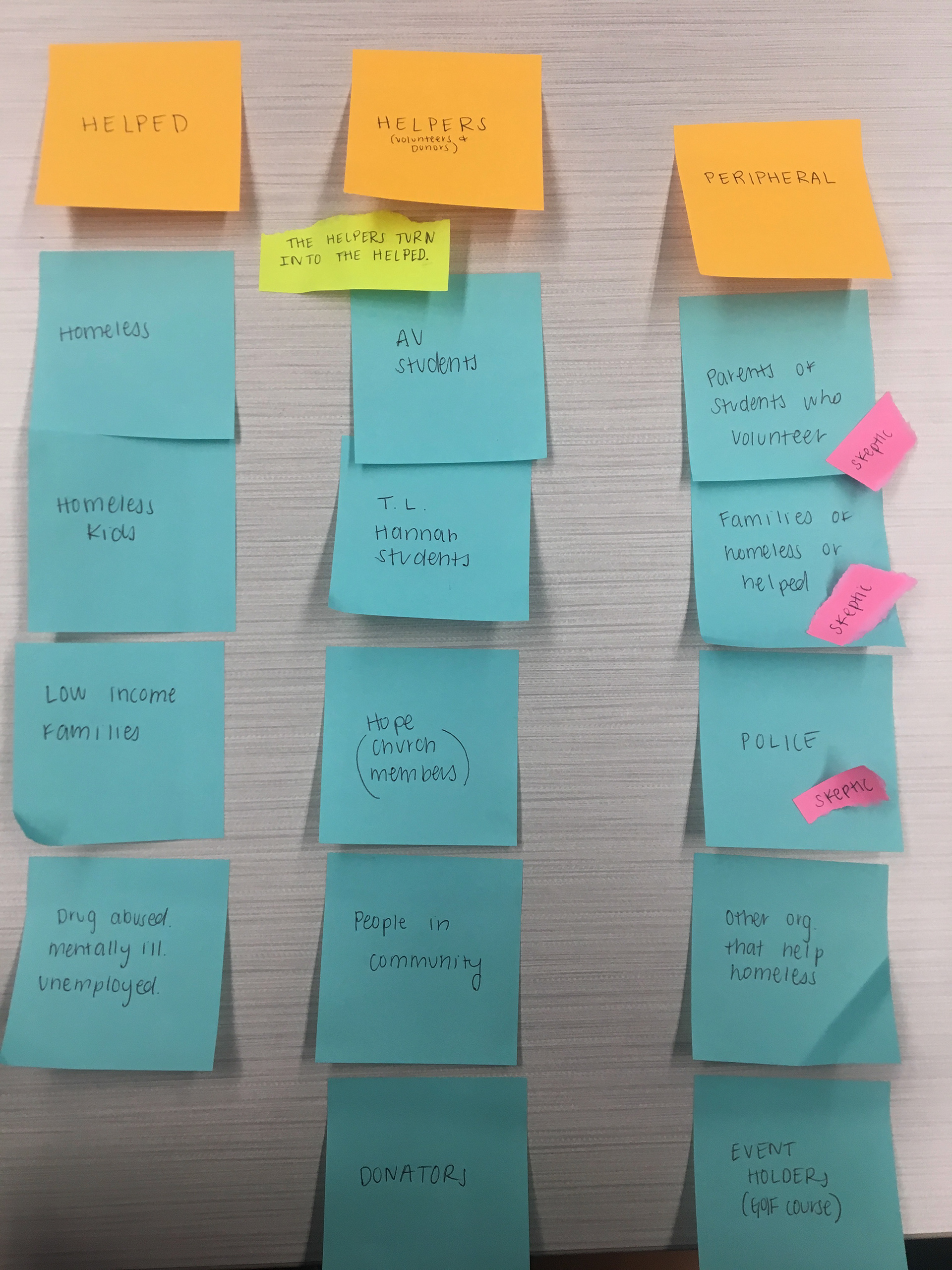
Using sticky notes to map out and categorize all of the people effected by this non-profit helped to further understand who would most likely use the website. It was discovered that the main users would be the "helpers" not the "helped." Most people clicking onto the website are looking to donate or volunteer.
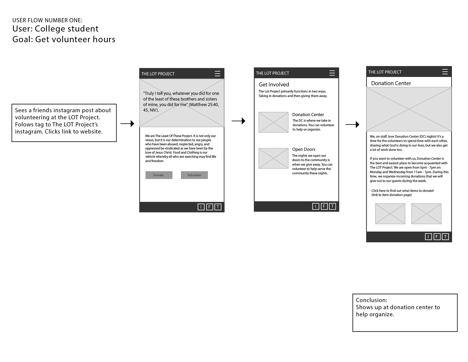
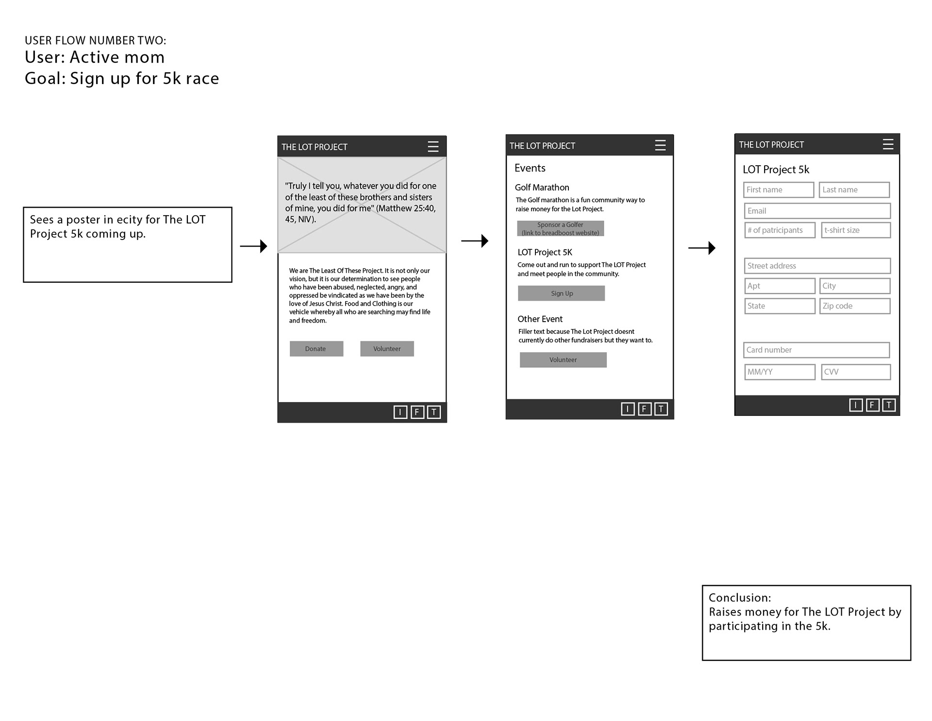
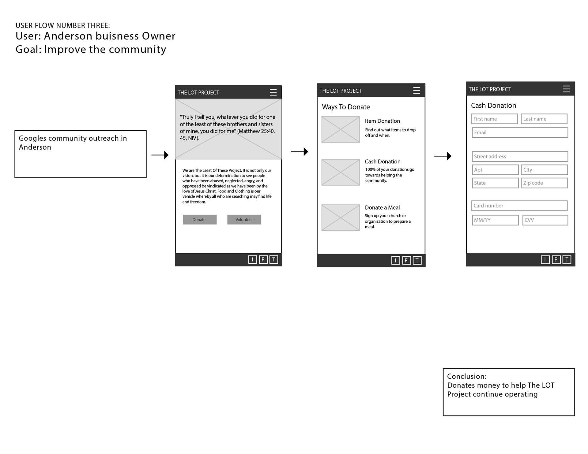
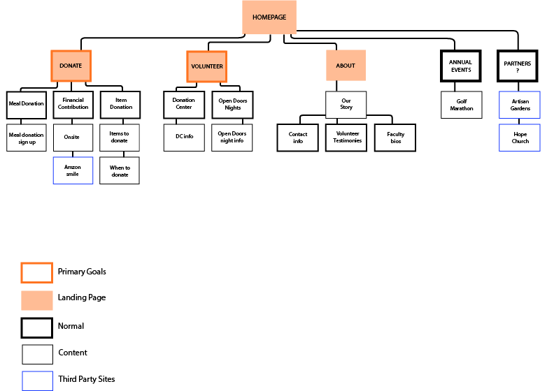
The following is three different examples of possible user flows. The donate and volunteer buttons are front and center on the homepage since these are the two main objectives.
Wire frame of entire site including main objectives as well as secondary information pages.
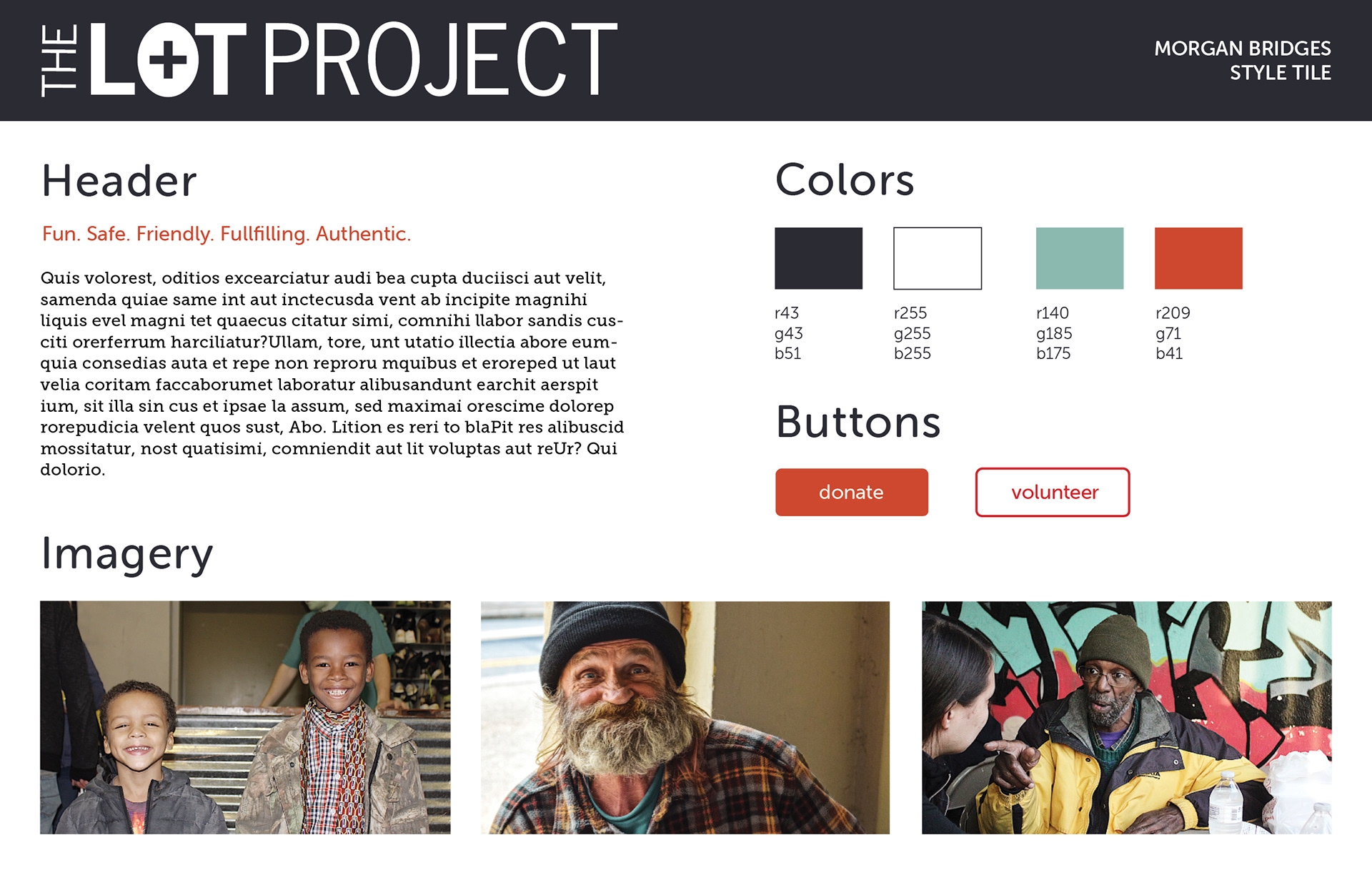
Style tile displaying color, type, layout and imagery choices that are meant to convey a fun, safe, friendly and authentic experience. Contrasting colors (orange and green) aid the user in navigating the website.